
People gravitate toward other people, it is just how we are wired. In a podcast I recently listened to, Susan Weinchenk talked about how to use natural physiological and psychological mechanisms to drive clicks and conversions on your website. I want to reiterate that these are not intended to trick people. We are merely using what we know about our brains to more easily engage with our website visitors. This article will cover three content types, and how you can make them more engaging by harnessing our natural instincts as humans.
Continue reading “Harness Natural Instincts for Better Online Reactions”
Tag: Design
Church Mobile Web Strategy: Content Priority
Many articles ago I talked about a content strategy document, which outlines every major piece of content on your church website. Additional information such as its primary purpose, the responsible party, and how often it should be updated can be layered in as well. Yet this document is the key to truly getting a mobile website correct. Because of the constrained screen size, your navigation, branding elements, text, images, video; everything on your website will be shifted to suit these devices. In this article I will outline how to update content priority and create guides that will help you design great layouts.
Continue reading “Church Mobile Web Strategy: Content Priority”
Vintage Design for Today’s Church Audience
Do not be afraid to utilize older design themes and imagery from historical churches to resonate with today’s audiences. There is currently a design theme that utilizes vintage art themes to remind people of “better times”. We often reminisce of the good old days, and how that time was somehow better (despite not having today’s technology). Churches can utilize this to remind visitors of a simpler time and find a unique way to present their brand on the web.
Continue reading “Vintage Design for Today’s Church Audience”
CWS Podcast – Ep. 16: Not Everyone is a Designer
 In this episode I explain how to provide web design feedback, and dispel the rumor that not everyone is a designer. Unlike many other activities, such as tuning a piano, baking a killer crème brûlée, or running an enterprise data center; website users try their hand at designing websites just because they have used one in the past. Later in the podcast, I will explain how designs can be successfully altered with the right types of questions, and hopefully without offending the designer.
Continue reading “CWS Podcast – Ep. 16: Not Everyone is a Designer”
CWS Podcast – Ep. 7: A Few More Tips on Photography
Last week’s episode originally had many more ideas and topics; but time constraints kept me to just the area of stock and custom photography. This week I will talk about some mechanics of photographs as well as a few tips and ideas for making photographs work with your website design. They need to compliment and serve your site, not just sit on top of it.
Continue reading “CWS Podcast – Ep. 7: A Few More Tips on Photography”
Sketching the Big Idea
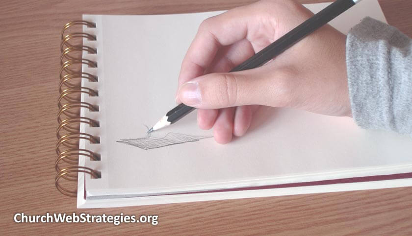
Website design is obviously a visually oriented craft. So why rely on just words to convey something a picture can do better? Whether you are communicating within your church web team, at a committee meeting, or a presentation to executive leadership; pictures will more easily communicate what your website will look like.
Continue reading “Sketching the Big Idea”
People Still Print
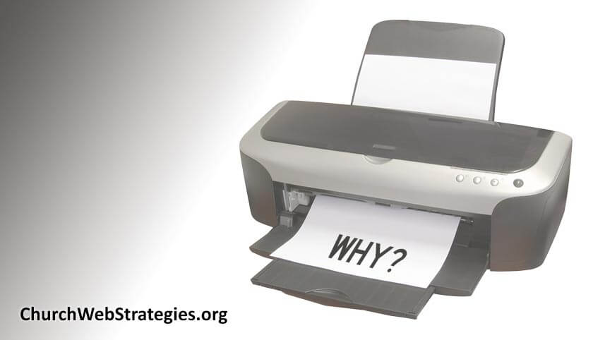
Believe it or not, people still print website content. Does your church website account for this? If not, there are specific techniques that when applied to targeted areas of your site; will provide your audience easier offline consumption as well as sharing your information with others.
Disabilities and Your Church Website: Hearing and Technology Impairments
Your target audiences most likely include people with disabilities and impairments. Although visual and cognitive impairments may seem like the most obvious obstacles to using a website, two others to consider are hearing and technological.
Continue reading “Disabilities and Your Church Website: Hearing and Technology Impairments”
Disabilities and Your Church Website: Visual and Cognitive Impairments
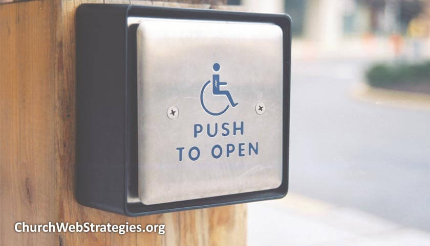
What good is a website if your audience cannot use it? A well designed website does not simply mean that it is aesthetically pleasing, easy to navigate, or can be viewed on a mobile device. It also means that your users can access the information despite any restrictions they may have. This article will delve into some of the common disabilities your users may have, and the barriers you can remove for them.
Continue reading “Disabilities and Your Church Website: Visual and Cognitive Impairments”
Hunting for the Elusive Website Fold
A review of your church website may result in someone mentioning “The Fold”. Although a valid worry at one time, this is a web design concept that is (or at least should be) extinct. Because of certain advances in technology it is not necessary to worry about this impossibly nebulous horizon. Instead I will encourage you to stop worrying about The Fold, and establish a prominent visual hierarchy for your pages.
Donations on your Church Website (Part 3): Influencing The Outcome

When you ask for donations on your church website, it matters as to how much you ask for. By pairing a suggested donation amount with a type of donation, you not only influence how many people give, but how much they finally give. I will explore methods and explain how they can be best utilized.
Continue reading “Donations on your Church Website (Part 3): Influencing The Outcome”
Redesign Content, Not Graphics
Your congregation does not attend services because of your branding. An attractive and well thought out logo does not bring new members through the door. The teaching, culture, and community are far more important than the color of your building. Then why does improving a website tend to involve redesigning everything? Focus on regular content updates instead of aesthetic changes to create a better experience for your users.