How are your products displayed?[/caption]In the previous article I presented the idea that churches may be in the business of selling physical and digital products online. Pastors are writing books, church bands are recording CD’s, and associated groups are producing a wide array of products that customers outside of the church are interested in buying. I laid out the main points of having a good item detail page, but like any good content, how you find it is vastly important. This article outlines the key points you must consider when creating a viable eCommerce storefront and shopping navigation.
Prioritize
The first thing you should consider is where the store will exist within your site. Should it exist as another section of the site? Perhaps a microsite would work better? How prominent is the navigational element that takes you to the storefront? You probably do not want to promote your store more than you would your core ministries or information on how to become a member. Probably your best bet is to re-examine your navigation structure and align. For more information, check out my podcast and article on the subject.
Browse
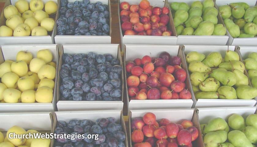
How are your products displayed?[/caption]After deciding on how your commerce will fit into your overall church website, identify what your organization scheme should be for your product browse structure. If you are just starting off selling items, you can get away with a simpler solution. A logical ordering of products in a grid layout may be all you need. However, once you get to a double-digit product count, you may need to consider organizing them on one page as before, but under separate headings. Once the listing grows to twenty or thirty items; the need to move products to separate pages. At this point it may be helpful to add extra text under your heading to describe the products featured on the page. This is not only an opportunity to add keywords for SEO purposes, but gives visitors on slower connections something to read to see if they are in the correct place before too many items load on the page. I will get into what data should load for each item later in this article.
Search
In certain circumstances, search is the default mode of finding products; especially when it comes to large retailers. While Amazon may be the gold standard of eCommerce, they almost exclusively present all their products via their search interface. Unless you have a mountain of diverse products, you should not need to rely too heavily on search results. Yet I would like to urge you to log what those search requests are, as outlined in my article on “Using Search Terms to Guide Content Updates”
Item Previews
I mentioned product browse grids as well as search results, but not what each of these should contain. While I am fairly certain I could write an entire article on this topic, I will just hit some of the basics here. The first would be a clear product thumbnail image that makes it obvious what your product is. Much like a bulleted list, a scannable line of images makes it easy to discern what you are looking for at a glance. The next two elements go hand-in-hand, as a title and description. These textual descriptions need to quickly and easily convey what the item is. In my previous article on eCommerce, I asked that you provide both factual and marketing content. This space should be just factual, with a short description of exactly what the item is. The key is to remove all the adjectives and adverbs and simply explain what it is. Save those awesome descriptors for the product detail page. Lastly, if possible; provide a price. When you give your customer enough information to decide if they want to buy your product, including the price, the click-through rate and conversion rate align more closely. You are not only removing frustration and unwanted surprise, you are showing your willingness to be transparent; which goes a long way in creating an ongoing relationship with your customers.
One last thing to consider in your previews is price. At some point in time you will need to disclose how much money your visitor is going to hand you in exchange for your product. The sooner you tell them this, the better. If your item has a price range, show that as well. Often you will want to bundle items together for a discounted price. While I intend to get into purchase suggestions in a later article, at least show the base price of your sets.
Action Item: As your storefront expands, see what changes you need to make in order to help guide your customers to the products they want to buy. While you do not want your store to overshadow the goals of your other ministries, if it provide critical support; you can still give it the attention it deserves. Through clear calls to action, easy navigation, and incremental refinement of content and organization schemes; your storefront will be a source of great products for your customers, and revenue for your church.
Photo courtesy of David Willeboordse

