
Imagine that your sound system did not work. Your pastor could deliver an amazing sermon. But few people would hear it. The same applies to printed words. Text is the primary method you convey information. Thus, it makes sense to use it in ways that are most effective. The concepts in this article will make your physical and digital text easier to read.
As I have said before, I am not a graphic designer. Aside from a few college classes, I have little formal art training. But I do understand usability and how fonts work. While my designs are not artistically interesting, they are usable. The following principles will allow you to make readable, and accessible designs.
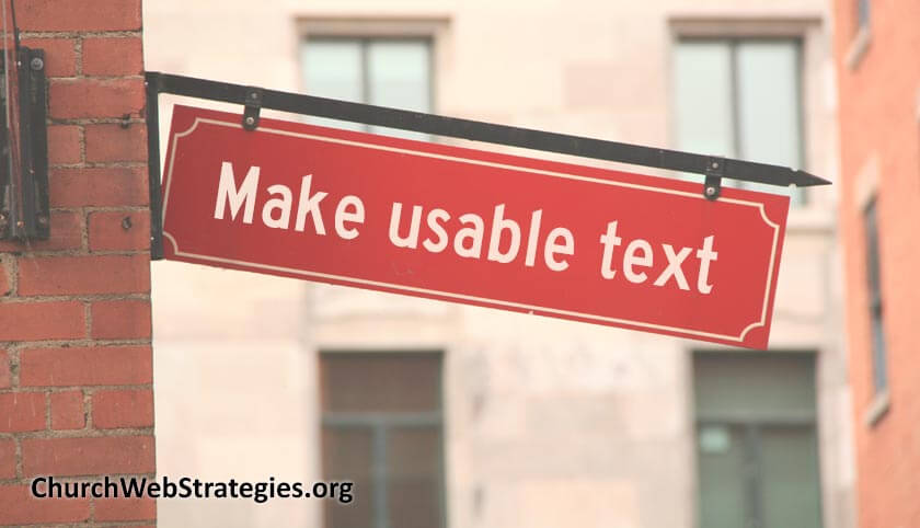
Alignment
The only time you should center align your text is for a sign or website title. Make instructions and larger blocks of text left-aligned. This allows your eye to move back to the same place after finishing a line of text. Also, avoid full justification. This means where the left and right sides make a solid line of text. It may look pretty on the page. But the spacing between letters and words are distorted. This makes the text less readable. Remember, this is an article about usability, not aesthetic wishes.
Font Type
Believe it or not, but hundreds of hours goes into making a font. Designers craft fonts for a balance of style and readability. They are often designed for specific purposes and mediums. Some are great for a paperback book, while others look better on a back-lit tablet. Yet others are ornamental, meant for a short, stylized heading. Please research what fonts work best for your scenario. Many WordPress themes had their fonts carefully chosen. I suggest using defaults unless usability tests prove otherwise.
Font Weight
As stated before, font designers work hard to make their fonts. But style sheets on the web can arbitrarily alter how they look. This includes altering the weight. Some fonts have built-in heavier weights, such as a bold variant. Many do not. Artificially altering the weight distorts the shape of the letters. This make them difficult to read. Keep weights as normal as possible to maximize its readability. Only use occasional bolding to draw attention to one word.
Capitalization
It is well-known that emails and text messages in all caps is considered shouting. You should not want to shout at your audience. Besides, proper capitalization helps you read better. You learned how to read normal text through years of practice in school. Posting content without capitalization breaks that existing model. Aside from titles and logos, you should always use proper capitalization.
Contrast
This last part will shift focus to the colors you use. Make the text color contrast enough from the background color. There are several tools out there, but I like this one from WebAIM.org. Plug in your color values. Then adjust them until you have a combination that meets accessibility standards. This will help you create text that is readable for a wide range of users.
Action Item
Text must be easy to consume. As I said, this applies to web pages, mobile applications, and physical signs in your church. Use the principles I outlined above to make your text more usable. Unless you have a formal background in design, stick to the absolute basics. Make words that are physically easy to read. The words and concepts may dive deep into your theology. But for now let us focus on the actual text.
Photo courtesy of Jonathan Fletcher