
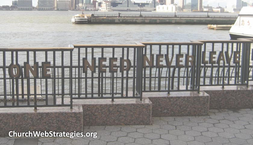
Your website and social media campaigns can learn from architects. Their craft is a mix of engineering and art that mirrors web professionals. There is a reason the most effective social media posts follow this principle; photos with overlayed text. You should see an example of this above this very post! Telling churches to just add text to a photo is easy advice. This article will explore the many combinations of these two art forms that can yield great results. Yet, I wanted to take the time to dive deeper into this tool and see where there is room to expand.
Continue reading “Text and Images: Combining Artforms”
Tag: Design
Optimizing Buttons
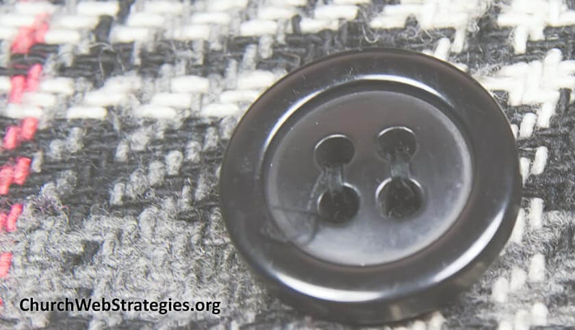
We all use buttons in our digital assets. They are our most critical element in creating a call to action. We want people to subscribe, join, download, and give. We are even so demanding to put “now!” with those requests. Yet we often miss the mark. We design and place buttons in ways that make them difficult to understand. Use these four tips to create the best buttons for your website and social media platforms.
Continue reading “Optimizing Buttons”
Creating a Great Church Intranet

What makes a great intranet for churches? The answer is deceptively easy. A great intranet helps church staff solve problems quickly and efficiently. By designing a great intranet, you highlight the many tasks and applications at your staff’s disposal. Plus your volunteer and paid workforce will see you are willing to invest in them and not just your ministries. This article delves into five area of focus to create a great church intranet.
Continue reading “Creating a Great Church Intranet”
What Skateboarders Can Teach A Web Team
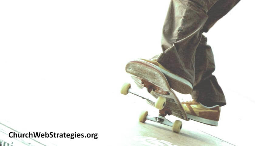
Many readers live near a park. Cities all over the world feature spaces where people can congregate and enjoy life together. Yet to a certain group of people, these spaces mean something completely different. They represent physical challenges of skill, dexterity, and balance. This group of people are skateboarders. Their unique view of landscape provides a few lessons people in church communications can learn.
Continue reading “What Skateboarders Can Teach A Web Team”
When Waiting is not an Option
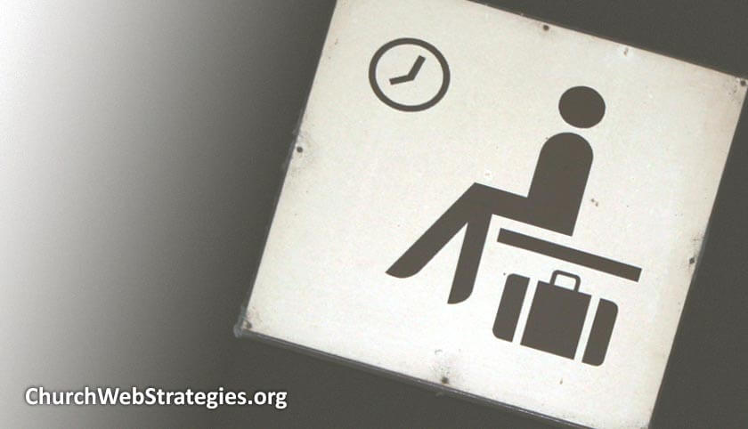
The Internet does not wait for anyone, and this includes your church. If you are waiting for the right time to move ahead with your use of the web, you will be left in the dust. This does not mean you need to jump at every advancement. Nor does it mean you should not prayerfully and carefully integrate technology. The problem is that latest technology may or may not be exactly what your church needs. Yet the longer you wait, the further you will lag behind. It is a tough decision whether to move ahead or continue to tweak what you already have.
Continue reading “When Waiting is not an Option”
Removing Website Clutter

Designers see clutter as too many things in one space. They want the right balance of elements on a page so it is aesthetically pleasing. Website visitors use the word clutter differently. They use it to describe items that impede their task. Unfortunately we are reluctant to remove elements in a design. This is often due to politics, unclear strategy, and/or fear of leaving something out. This article shows how you can use analytics and UX tools to remove clutter without sacrificing functionality. Here are a few “simple” steps I suggest taking.
Continue reading “Removing Website Clutter”
CWS Podcast – Ep. 65: Redesign Content, Not Graphics
![]() Your congregation does not attend services because of your branding. An attractive and well thought out logo does not bring new members through the door. The teaching, culture, and community are far more important than the color of your building. Then why does improving a website tend to involve redesigning everything? Focus on regular content updates instead of aesthetic changes to create a better experience for your users.
Your congregation does not attend services because of your branding. An attractive and well thought out logo does not bring new members through the door. The teaching, culture, and community are far more important than the color of your building. Then why does improving a website tend to involve redesigning everything? Focus on regular content updates instead of aesthetic changes to create a better experience for your users.
Continue reading “CWS Podcast – Ep. 65: Redesign Content, Not Graphics”
CWS Podcast – Ep. 62: Pause for a Cause
![]() Two years ago when my family visited Disney World I noted a few things that translated to an article, and podcast, for church websites. This episode is about how to help your audience pause at the right spot to notice something on your website. This pause will help them focus on something important, and hopefully cause them to take action.
Two years ago when my family visited Disney World I noted a few things that translated to an article, and podcast, for church websites. This episode is about how to help your audience pause at the right spot to notice something on your website. This pause will help them focus on something important, and hopefully cause them to take action.
Continue reading “CWS Podcast – Ep. 62: Pause for a Cause”
CWS Podcast – Ep. 55: Your Opinion Does Not Matter
![]() I hate to be the bearer of bad news, but if you are a pastor in your late 40′s, your opinion of a website aimed at an early 20′s audience really does not matter. Well now that the awkward part of this article is over, I will move on to what really counts; and that is if your church website is meeting the established business goals. In this article I will explore different ways the decision makers can provide good feedback and shape a great experience for your target audience.
I hate to be the bearer of bad news, but if you are a pastor in your late 40′s, your opinion of a website aimed at an early 20′s audience really does not matter. Well now that the awkward part of this article is over, I will move on to what really counts; and that is if your church website is meeting the established business goals. In this article I will explore different ways the decision makers can provide good feedback and shape a great experience for your target audience.
Continue reading “CWS Podcast – Ep. 55: Your Opinion Does Not Matter”
CWS Podcast – Ep. 41: Even If You are Wrong, Be Consistent
![]() In this episode I ask that you utilize patterns to create a consistent experience on your church website. Inconsistent designs are more disruptive than a bad design. They forcesyour users to constantly learn new mechanisms to use the site. Instead, explore page patterns, color palettes, and navigation. These common website mechanisms should provide visitors with a familiar and comfortable experience that keeps them on your site and hopefully walking into your church.
In this episode I ask that you utilize patterns to create a consistent experience on your church website. Inconsistent designs are more disruptive than a bad design. They forcesyour users to constantly learn new mechanisms to use the site. Instead, explore page patterns, color palettes, and navigation. These common website mechanisms should provide visitors with a familiar and comfortable experience that keeps them on your site and hopefully walking into your church.
Continue reading “CWS Podcast – Ep. 41: Even If You are Wrong, Be Consistent”
CWS Podcast – Ep. 38: Inspire Confidence on Your Church Website
![]() What if your pastor’s sermon had no major points, no reference to scripture, and no relevance to your daily lives? What if they wore a distracting outfit, talked too quietly, and stuttered? I doubt that pastor’s preaching career would last very long. So why would it be OK for your website to do the same thing? Create good looking, recently updated, easily understood, relevant websites and you will inspire confidence in your visitors. Please note that most of these are huge topics, each warranting a entire series of discussions. However, this is a primer that I hope will get your wheels turning on what directions your church web team can move toward.
What if your pastor’s sermon had no major points, no reference to scripture, and no relevance to your daily lives? What if they wore a distracting outfit, talked too quietly, and stuttered? I doubt that pastor’s preaching career would last very long. So why would it be OK for your website to do the same thing? Create good looking, recently updated, easily understood, relevant websites and you will inspire confidence in your visitors. Please note that most of these are huge topics, each warranting a entire series of discussions. However, this is a primer that I hope will get your wheels turning on what directions your church web team can move toward.
Continue reading “CWS Podcast – Ep. 38: Inspire Confidence on Your Church Website”
CWS Podcast – Ep. 27: Take Something Away
 In this episode, I explore the design concept that sometimes, “less is more”. That maybe your next church website redesign includes taking something away from a page rather than adding another feature or callout. Unfortunately, this is easier said than done. We are often afraid that if we take a link away, we are removing a path to content. Unless you are arbitrarily cut off branches of your primary navigation, you should be fine. Perhaps when you remove that extra clutter of the ad asking members to join your choir, the button taking the visitor to the membership form becomes more obvious and enticing.
Continue reading “CWS Podcast – Ep. 27: Take Something Away”